
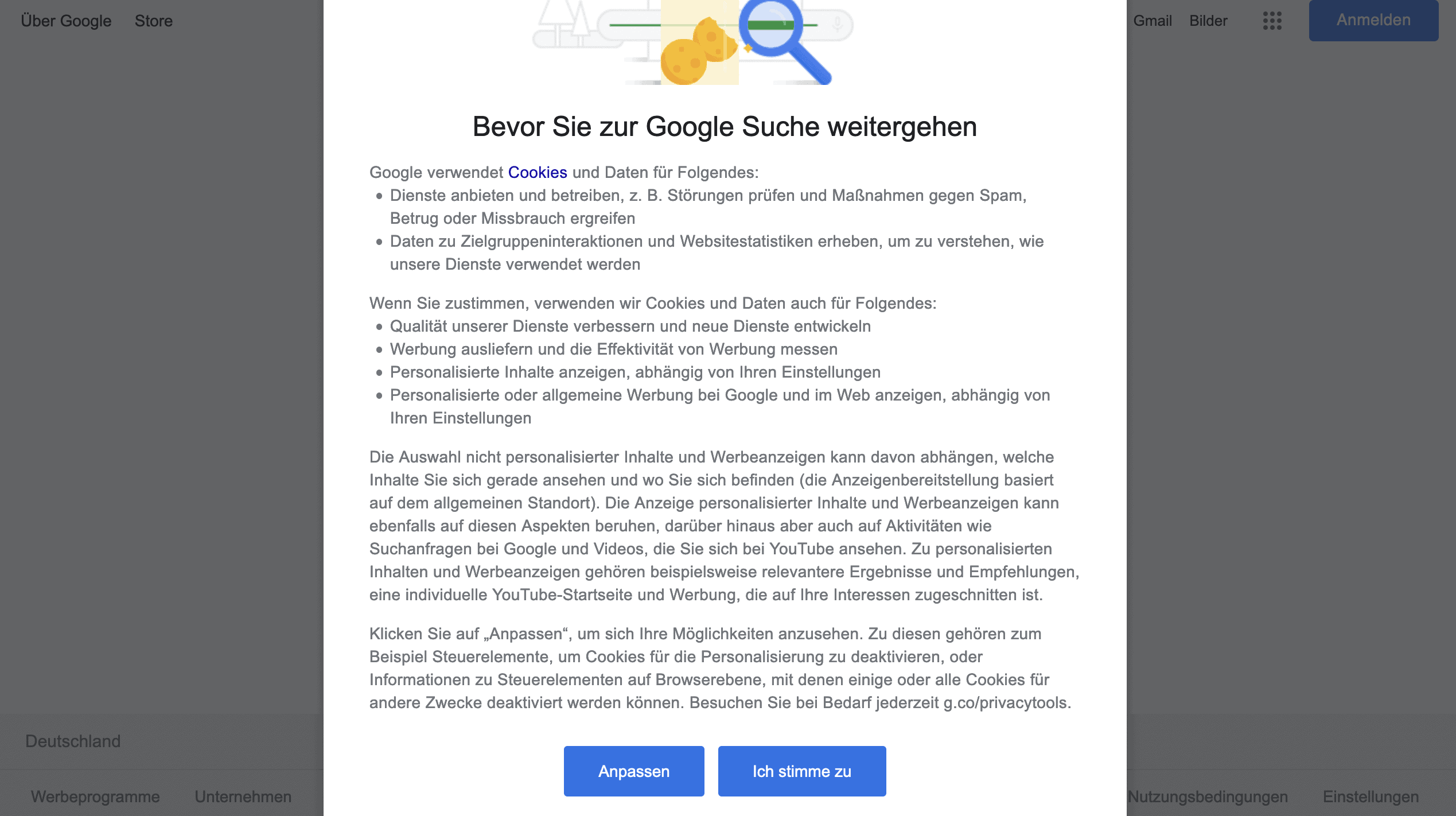
Mirror, mirror on the wall, who has the most beautiful (and at the same time most data-compliant) cookie banner in the whole wide world?
Cookie banners and data protection have stuck together like glue ever since the ECJ’s ruling in case C-673/17 (opt-in cookie banner obligation). If you have read our article What is a cookie banner? carefully, you already have a good overview of the legal requirements for cookie pop-up windows and banners. Now that you as a website operator know when a cookie consent banner is required at all and what you need a cookie banner for, let’s move on to the creative part: the cookie banner layout.
Data protection on the Internet is a sensitive issue, which is why many website visitors are also sceptical about cookie banners. A banner or pop-up window that denies access to the website until you have given your consent to so-called cookies – looks anything but trustworthy at first glance. This makes it all the more challenging for website operators to encourage their visitors to give their consent to the setting of cookies and the processing of personal data. The art therefore lies in using visual means to maximize the consent rate of visitors while remaining within the bounds of the legal.
At least as important as aesthetics is a correct cookie notice text.
An incorrect text in the cookie notice can be decisive for incorrect compliance with data protection. You can find a GDPR-compliant cookie notice sample text in our article on cookie consent texts, in which we dissect and explain a cookie banner text example in more detail.
User experience design (UXD) addresses the design of the user experience. UXD aims to design a website or an app in such a way that the experience of the specific target group is improved or optimized. At the heart of it all is the interplay of usefulness, functionality and attractiveness.
Accordingly, the most beautiful cookie banner design is of no use to you if you do not inform your visitor equally about the purpose for which your website uses cookies in the first place. The cookie banner should therefore offer your visitor the added value of being informed as simply as possible about what they can consent to.
UI design and UX design are often mistakenly equated. Even though both terms sound very similar, there are essential differences. Unlike UXD, User Interface Design (UID) describes the design of the graphic interface on which users act (exchange between man and machine). In terms of UID, ease of use, intuition and efficiency are important keywords.
Your website visitor should therefore be able to find all the important buttons of the cookie consent banner immediately without having to fight their way through a click maze. In general, click mazes should be avoided. However, you will find them in some cookie banners on the internet. And this quite deliberately! For example, the TCF standard relies on a high level of complexity for the user in order to urge them to interact in the simplest way possible: Accepting all cookies.
In contrast to UX design, UI design picks up the target group not on an emotional but on an interactive level.
Cookies on the internet – probably not even the cookie monster likes them. In our blog article Everything you should know about web cookies! you can read what the little text files are all about and why they may not be as evil as is often assumed.
Nevertheless, this does not change the fact that many Internet users would like to ban cookies – not to mention cookie banners (also called opt-in banners) – from the World Wide Web. Cookies are simply annoying! That’s why many website operators are now using various methods to elicit consent from their visitors, beyond the use of cute biscuit emojis in cookie banners.
But beware! There is a fine line between legally compliant and illegal. We will explain why in the following.
Dark Patterns – what is that?
 If you use Dark Patterns, we have officially lost you to the dark side of the Force 😉 Roughly summarized, dark patterns are intended to pursue user-unfriendly design patterns that are meant to deceive users or lure them into a trap – among other things, to make an unintentional purchase or carry out an unwanted subscription. And where could such deceptive strategies be super used to obtain a high quantity of data? Crystal clear: in cookie banners!
Dark patterns are in a legal grey area, as the law usually does not take a concrete position on them. However, the tendency is for many rulings to favour data protection. Consequently, ideas that are still in a grey area today may be prohibited tomorrow. Consequently, you should keep your hands off such methods!
An example for Dark Patterns
Now, you’re probably wondering what exactly dark patterns strategies look like in practice. The dark patterns trap can be sprung at many points of contact with a website.
In terms of structure, font, text choice and buttons, cookie consent banners are often designed to make it as difficult as possible for visitors to a website to refuse cookies or to urge them to accept all cookies.
Example: Website visitors must first click on several buttons in order not to have to accept all cookies.
Nudging – what is it?
Similar to dark patterns, so-called “nudging” is an ethically controversial method of obtaining consent. Nudging can be seen as a precursor to dark patterns. “Nudging” means something like “pushing”. The aim is to nudge the user in the “right” direction – in other words, to obtain their consent to the setting of all cookies and the processing of personal data. Simple yes/no answer options are now only available in the rarest of cases. Rather, many cookie consent banners now have a quiz-like character, with many open questions and even more vague statements.
Well-known examples of nudging in cookie notices include:
- Colour choice: An “Accept All” button coloured in the signal colour green (= everything OK) in contrast to a light grey, barely visible “Reject” or “Configure Cookies” button.
- Preferences: Boxes already ticked
- Data protection-unfriendly one-click solutions: The user first has to fight their way through a flood of clicks to make privacy-friendly settings. In contrast, a single click on a large “Accept All” button – and the annoying cookie banner is gone from the screen.
A little tip: If you’re really keen to experience Dark Patterns through play, you should definitely not miss this free game!🎮
In the following video you can see prime examples of how you should never ask for your visitors’ consent 🙃
In the video by giant_grapefruit you can see how a cookie banner is displayed. They have different animations that automatically move the “decline” button when you move the mouse so that you can never click it. This is legally permissible of course – not 😀
Where does influence end and targeted manipulation begin? As you can see, as a website operator it is not easy to reconcile your own interests and legal compliance – although in case of doubt we always advise compliance with the latter. So while you should let your creativity run freely in the design of eye-catching cookie banners, you should make sure that you always meet the criteria of informed consent.
In the following, we will use various cookie banner examples to show you which cookie banners are already well thought out and where the execution is still lacking.
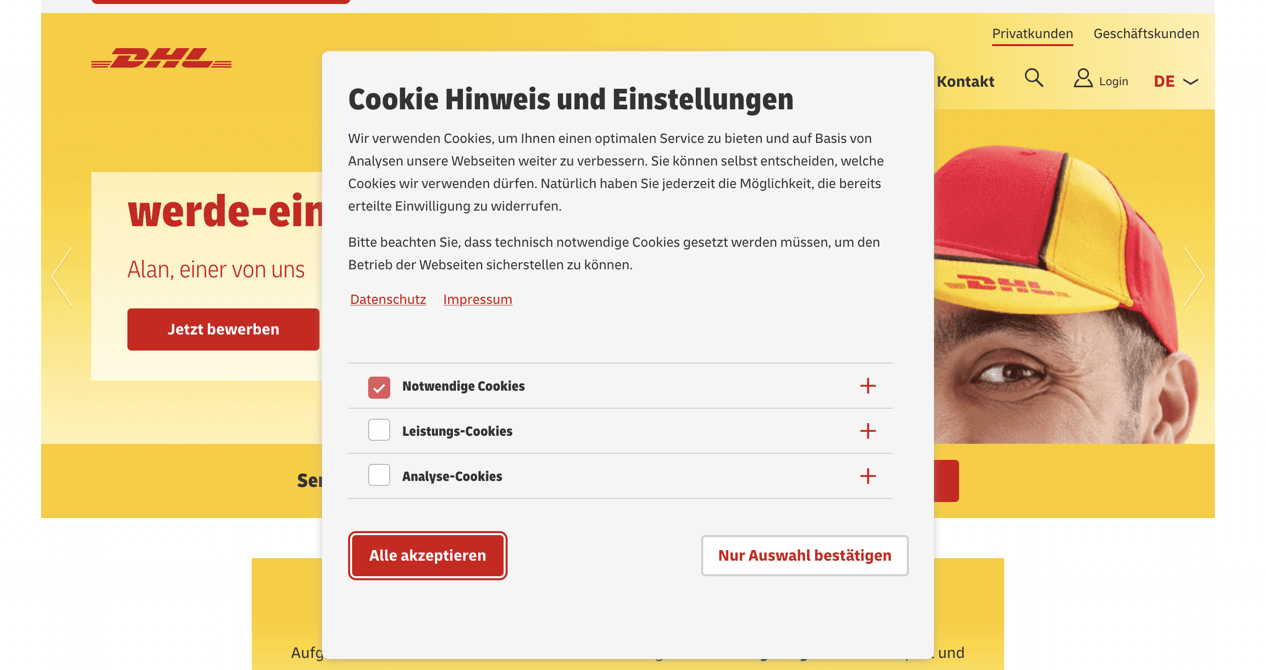
This example explains why cookies are set in the first place. Furthermore, the classification into the individual cookie groups is directly visible – without the user having to click through the banner several times. No reject button is presumably allowed here, because by default all groups that are not necessary can be selected and deactivated. The user can therefore simply decline via the “Confirm selection only” (“Nur Auswahl bestätigen”) button. The only thing that is noticeable in this example is that in the details of the third-party cookies, it is not specified which provider sets the cookies and its privacy policy is missing. Apart from that, only the reference to the protection of minors is missing.
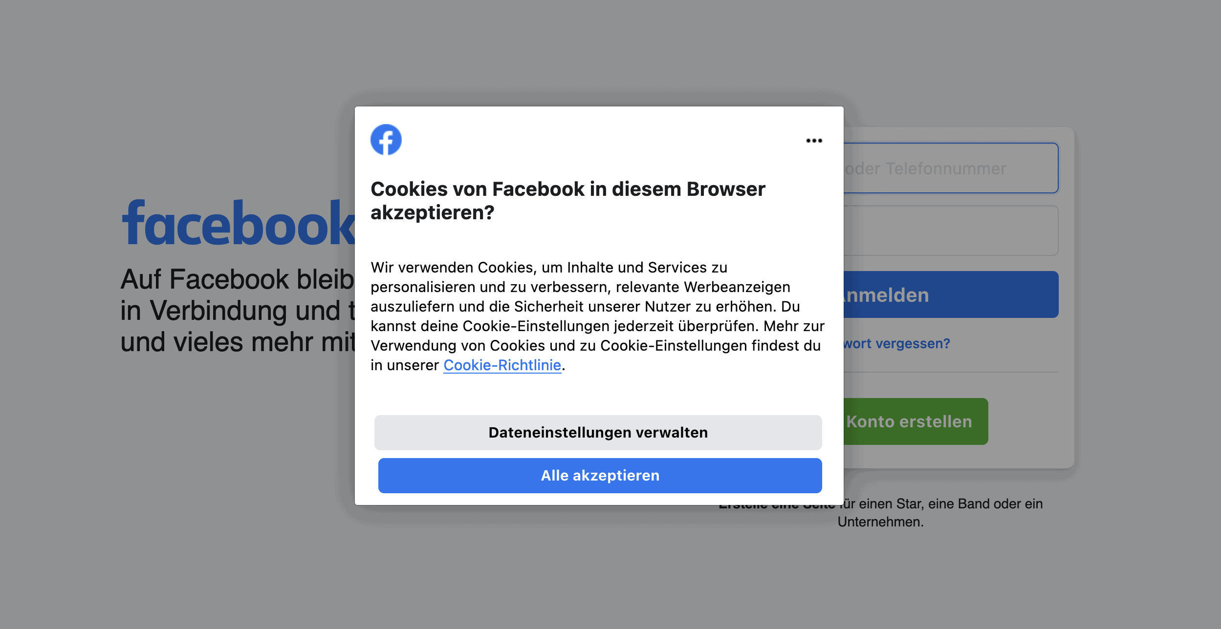
Again, the button to reject cookies is missing. However, the language of the cookie banner can be set directly in the banner itself. In this case, the privacy policy and imprint are not linked – but the cookie policy is, which informs the user in detail about the use of cookies and the cookie settings. Important to know: Privacy policy and imprint do not have to be linked in the cookie banner, as long as they are directly accessible. Often – as in this case, – the cookie banner obscures the actual links. Therefore, the privacy policy and imprint should be linked somewhere else – most sensibly in the cookie banner.
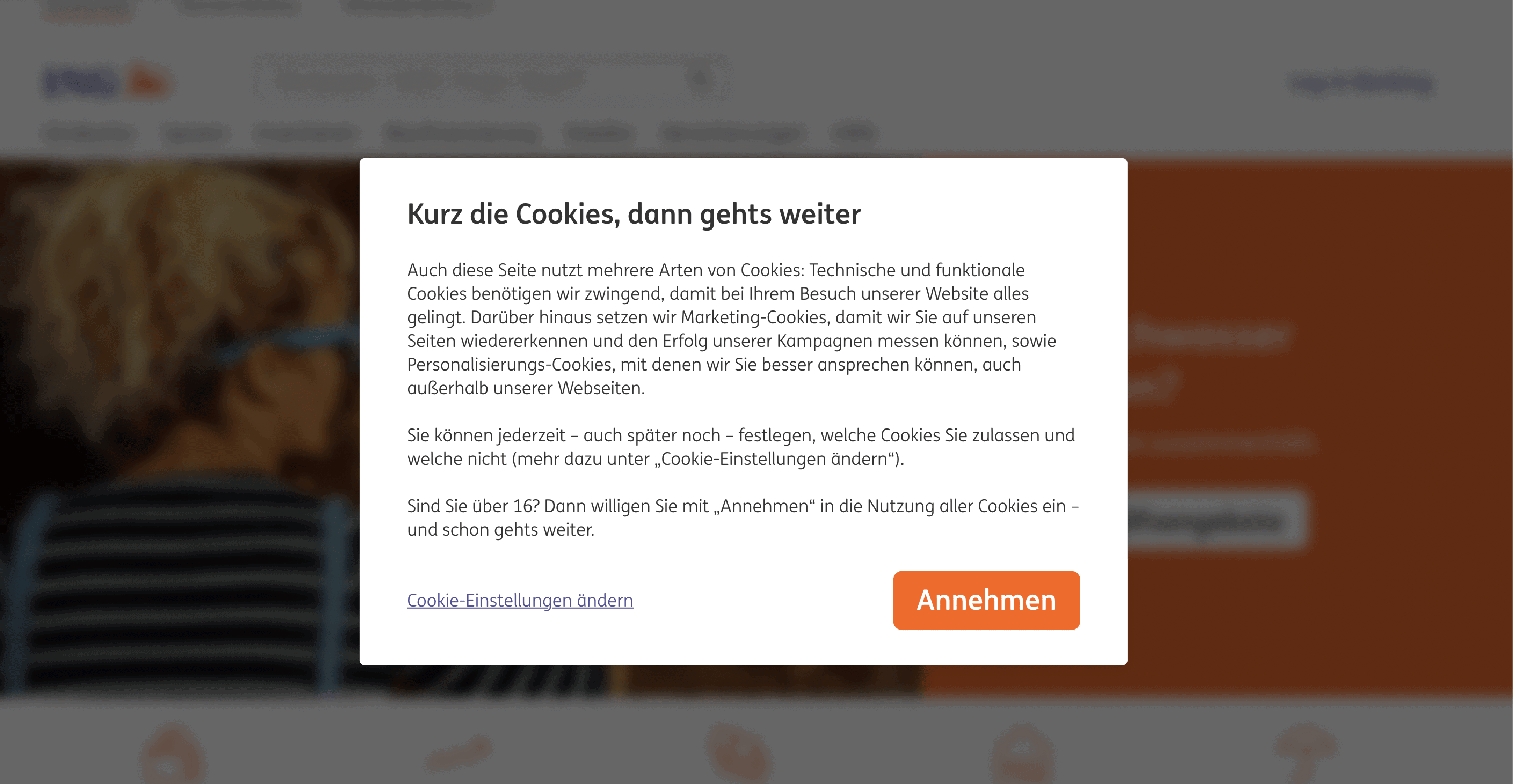
Example 3: No nudging strategies
The user receives information about why cookies are set in the first place. In addition, they have direct access to the “refuse” (“Ablehnen”) button, which is not put in the background due to manipulative visual means.
Example 4: Payment function
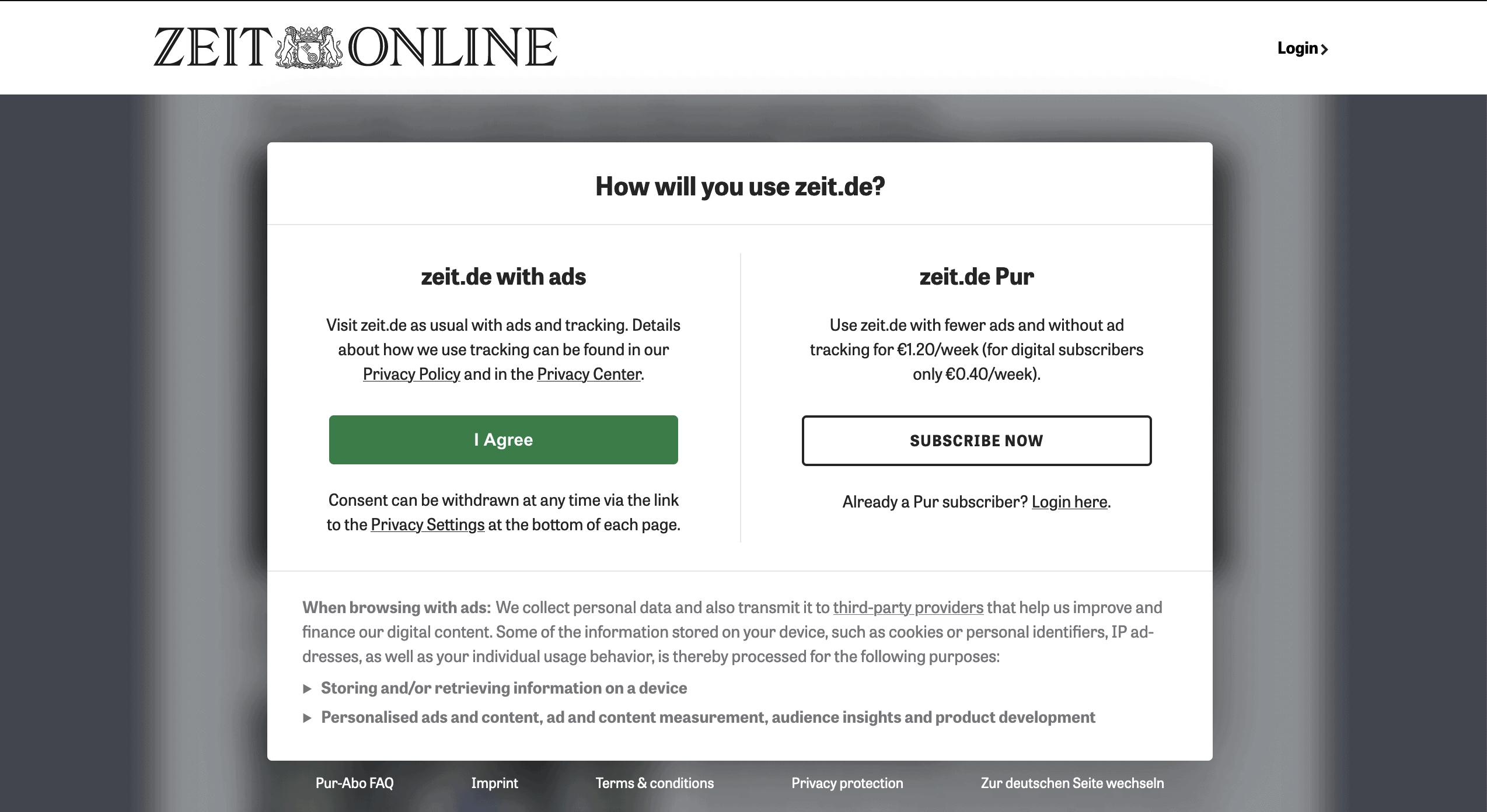
You can’t get past this cookie banner until you either give your consent or sign up for a monthly subscription. You will often find this type of cookie notice on online newspapers because they are sometimes financed by advertising revenue. Normally, you can’t force the user to agree, but in this case you can. According to the EDSA, such a “cookie wall” may be used. Such portals are financed by advertising revenue in order to guarantee high-quality journalistic work – which should be worth a quick click on “Accept all” 🙂
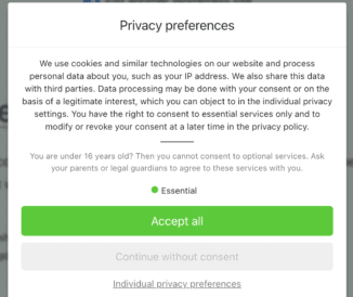
Example 5: Age reference
What you may have noticed about this cookie banner is the age question. According to Article 8 of the GDPR, consent to services that process personal data and/or set cookies can only be given from the age of 16 (different in some EU countries) or together with a parent or guardian.
Example 6: Special case of age warning
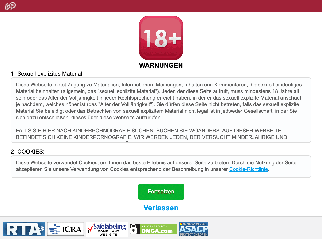
Websites that are aimed at an over-18 audience (e.g. erotic sites or sites that offer gambling) must ensure from the outset that their visitors are old enough to be able to access the site – for example, by verifying their identity card. Therefore, the age reference in the cookie notice text itself is not mandatory. In many cases, however, the use of an opt-in banner is not permissibly completely avoided.
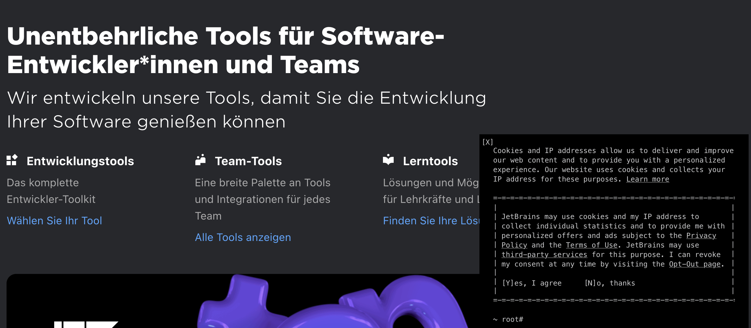
Example 7: TCF standard
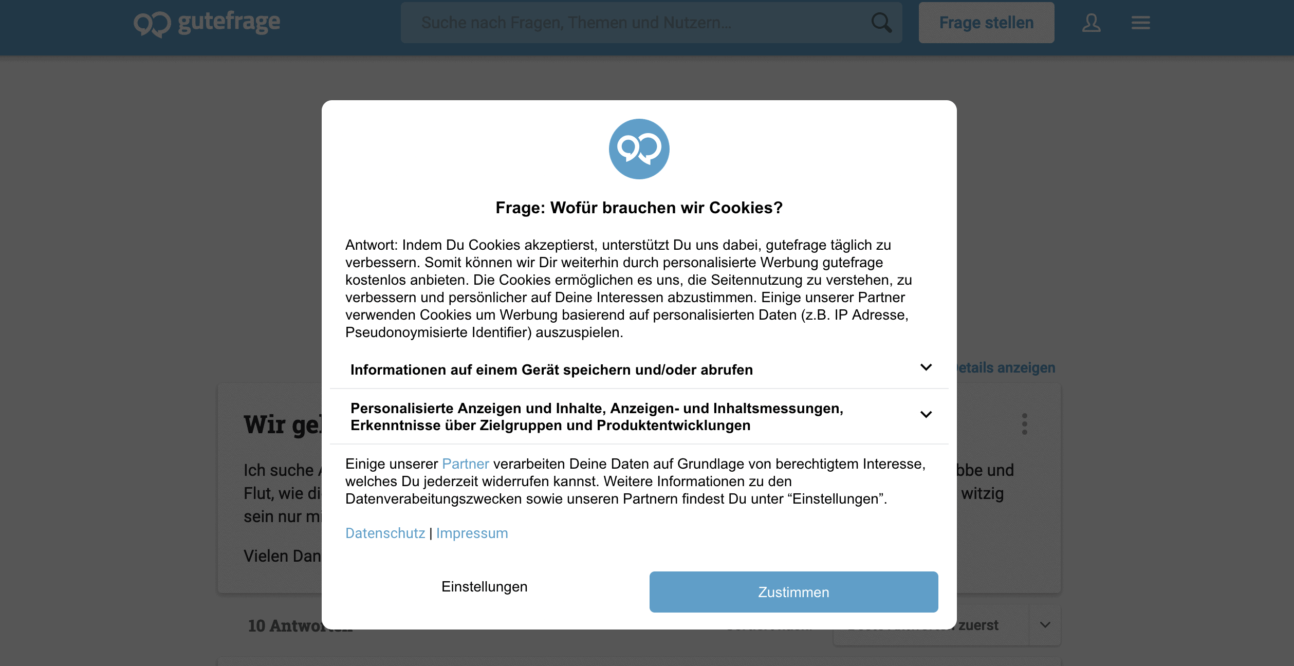
A perfect example of how corporate identity can also be implemented in the cookie banner layout. In addition, the website adheres to the specifications of the TCF (Transparency and Consent Framework). However, it is again noticeable in this example that the “decline” button is missing on the first page.
Example 8: Missing information

This cookie notice looks super stylish, but lacks essential information and is therefore not legally compliant. It neither informs about the benefit of using cookies, nor which cookies are involved. Even though the button for rejecting cookies in this example was implemented very creatively, it is questionable whether this is legally compliant at all. According to several rulings, a “reject” button should be clearly labelled.
Example 9: Click labyrinth
Who would have thought it: even big players in the Internet business are not without their faults. On the contrary: refuse cookies? No way! This cookie banner is the perfect example of a click-maze with bouncer character. On a positive note, however, access to legally relevant pages is again guaranteed. In addition, detailed information on the use of cookies is provided.
Example 10: Link to third-party provider
In terms of layout, the cookie banner again adapts perfectly to the target group. In addition, the purpose of obtaining consent, the option of rejecting cookies and the reference to third-party providers are displayed.
You’re probably quite flabbergasted by all the impressions and rules that come with creating an aesthetically pleasing cookie notice template. Not only in terms of layout can mistakes happen quickly. Typical mistakes occur more quickly than you think!
So that you don’t have to rack your brains over what exactly your colour choice must look like, what texts and buttons your cookie banner must contain in order to meet the requirements of the legislator, we offer you more than 20 ready-made design templates in Real Cookie Banner – of course customisable. So, you can design your data-compliant cookie banner according to individual preferences.
So, what are you waiting for? Create your GDPR-compliant eye-catcher cookie banner now and make your consent smoke🔥 – without any mean tricks 😉